The Typography Fatigue
Let’s be honest: in the world of UI/UX, Roboto is the new Arial. It’s the “when in doubt, use this” safety net that has caught us all at some point. It’s universally agreed upon, regardless of trends, age, or vision.
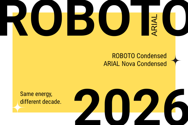
But after years in this industry, I’ve realized that playing it safe is often just a symptom of “choice paralysis.” With thousands of families available at our fingertips, picking the “perfect” font has become so exhausting that we often just default to what’s easy.
The Montserrat Confession: An Ego Check
I remember 2015 vividly. I was in a total frenzy, slapping Montserrat and Roboto on everything: web, print, you name it. I thought I had found the holy grail of typography. Then, around 2020, I stumbled upon a post by another designer calling out the “extreme overusage” of these fonts.
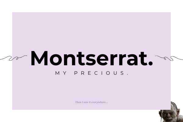
My first reaction? I was offended. “How could you not love these?” I thought. But after the ego cooled down, I took a hard look at my portfolio and realized they were right. I wasn’t choosing them because they were the best fit… I was choosing them because they were comfortable. Since then, I’ve made it my mission to give other font families the stage they deserve.
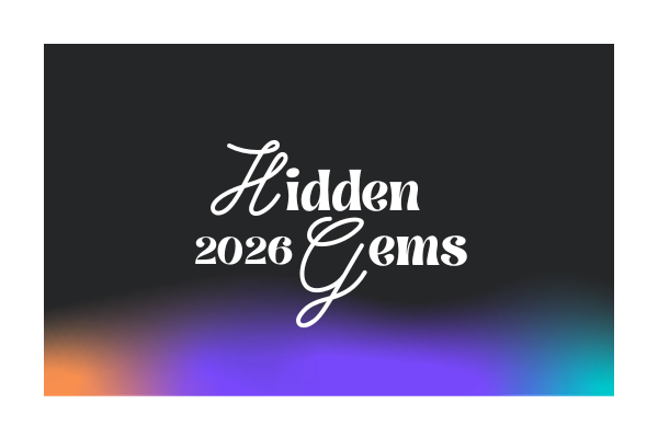
The “Hidden Gems” of 2026
If you’re ready to move past the Roboto-default era, here’s what’s currently living in my projects (and why):
- Syne: My personal favorite and the voice of this very blog. It’s bold, it’s got character, and it refuses to be ignored.
- Nunito Sans: My “rebound” font for when I’m absolutely sick of Roboto. It’s rounder, friendlier, and adds a bit of humanity back into the UI.
- DM Sans (Black): When I want that “Brutalist” edge. It’s heavy, punchy, and perfect for visuals that need to scream “Modern Tech.”
- Prata: Pure elegance. It’s a shame it doesn’t have more styles, but for a high-end, sophisticated look, it’s unmatched.
- Playwrite Romania: This choice is purely emotional. As a designer who spent hundreds of school hours perfecting cursive, I feel a sense of melancholy. New generations aren’t learning to write like this anymore. Using Playwrite isn’t always about “practicality”, it’s about preserving a “human touch” in a world that’s becoming increasingly digital and sterile.
The Figma vs. Browser Drama
One of the most frustrating parts of being a designer is seeing your “pixel-perfect” Figma mockups lose their soul during implementation. Why does the font weight look different?
- Rendering Engines: Browsers like Chrome and Safari use different anti-aliasing algorithms than Figma. A “Medium” weight in Figma might look “Bold” or “Anemic” once it hits a live URL.
- The Retina Factor: High-density displays (like Apple’s) render fonts much sharper, while standard monitors might “smear” the pixels, altering the perceived weight.
- Missing Diacritics: The ultimate heartbreak. You find the perfect font, only to realize the “ș” and “ț” look like they were borrowed from a 1990s typewriter.
My Senior Tip: Don’t just hand over the Figma file and pray. Talk to your developer. Sometimes a simple CSS property can bridge the gap between your vision and the reality of the browser.
The “Matchmakers”: Tools to Stop the Guesswork
Choosing a font is only half the battle. The real “Senior” skill lies in finding the perfect partner for it. We’ve all been there, staring at a blank Figma canvas, pairing fonts like we’re throwing darts in the dark. In 2026, we have better ways to work.
Here is my curated toolkit for creating pairings that actually make sense:
1. Fontjoy
Think of this as Tinder for typography. Fontjoy uses machine learning to analyze the visual characteristics of fonts and find their perfect match.
The Senior Move: Use the “Contrast” slider. If you have a high-character font like Syne for your headings, pull the slider toward “High Contrast” to find a neutral, readable partner for the body text. It’s the fastest way to break a creative block.
Most designers ignore this, but it’s a goldmine. Google created a dedicated library of typography best practices. It’s where I go when I need to verify if a font is truly “bulletproof” for long-form reading or if it’s just a “display” beauty that will fall apart in a complex UI.
3. Fontpair.co
Sometimes, you don’t need AI; you just need to see what’s already working. Fontpair is my go-to for “classic” combinations. If I’m looking for a Serif + Sans Serif duo to give a project a more editorial, high-end vibe, I check here first to see real-world examples that have already been investigated by the community.
4. Type Scale
Design isn’t just about “vibes”; it’s about math. I never choose font sizes by eye anymore. Type Scale helps you build a visual hierarchy based on mathematical ratios (like the Major Third or Golden Ratio).
Pro Tip: Using a consistent scale ensures that your H1, H2, and Body text feel like they belong to the same family, even if they are different weights or styles. It’s the difference between a “DIY” site and a professional digital product.
💡 A Note on Balance
As I mentioned with Playwrite, sometimes the best tool is your own intuition. If you’re using an emotional, handwritten font, treat it like a “quiet whisper.” Pair it with something invisible and sturdy. Use your tools to find the balance, but use your 18 years of experience to know when to break the rules.
The Bottom Line: Design for the Human, Not the Portfolio
After nearly two decades in this game, if there’s one thing I’ve learned, it’s this: The best font is the one that gets out of the way. We often get caught up in the “ego” of typography, searching for that one obscure Google font that no one else is using just to feel “original.” But at the end of the day, our job in UI/UX is to facilitate communication, not to distract from it.
Whether you choose Roboto because it’s a reliable workhorse or Syne because it fits a brand’s soul, do it with intention. Test it on a cracked screen, check it in a browser you hate, and for the love of design, make sure the diacritics don’t break the layout.
Typography is where science meets emotion.
Use the tools, respect the math, but don’t forget to listen to that “melancholic” voice that reminds you why you started designing in the first place.
This is a reminder that at the end of the day, we aren’t just picking “cool” fonts for ourselves, but for the person on the other side of the screen.
Comments are closed